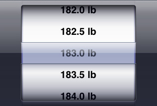
Although the iPhone picker control allows you to display multiple wheels at a time, FatWatch presents you with a single wheel to enter your weight. I was recently asked, why not use one wheel per digit, like some other apps do?
When you launch FatWatch, most of the time you probably want to quickly enter your weight and then close it immediately, before getting dressed and heading to work. I decided to design the weigh-in screen to be as efficient as possible in this scenario. When considering whether to “split the picker”, there are two considerations that work in the single picker’s favor: scrolling distance and Fitt’s Law.
It is true that scrolling from FatWatch’s default of 200 lbs to your initial weight can be tedious, especially if you’ve selected a scale precision of 0.1 or less. However, from that point on, FatWatch remembers your weight and always defaults to your average weight on the day you select. Since your scale reading will only be a few units away from your average, you won’t have far to scroll.

If each digit is on a separate wheel, the amount of scrolling required varies wildly depending on the numbers involved. For example, changing from 168.5 to 167.5 is easy: adjust the third wheel one unit. But to change from 168.5 to 170.0: adjust the second wheel one unit up, the third wheel eight units down, and the last wheel 5 units down. Got that? It’s not hard to figure out, but it is work that your brain has to do. And it has to do it early in the morning when you’d rather be crawling back into bed.

Now, all that work is worth doing if we don’t know anything about the number you are going to pick. When you set an alarm, for example, you are just as likely to pick 8:25 AM as 11:00 PM, so an alarm clock app is probably saving you work by letting you pick the hour and minute separately. But since FatWatch knows the number you want to enter won’t be far from the default, a single picker makes more sense.
And what about Fitts’s Law? It’s a principle of interface design that states the time to acquire a target is inversely proportional to its size. In other words, it takes more time to tap a small thing than a big thing. By using one wheel, FatWatch gives you a very large target to hit and swipe with your finger. If it was split into three or four wheels, you would have four separate and much narrower targets. So, not only do you have more wheels to adjust, it will take you longer to adjust each one of them.
I hope you enjoyed this explanation of the thinking behind FatWatch’s design. The 1.4 update is almost finished; when it’s done I’ll have more design stuff to write about.